
A multi-line graph maker lets you put several sets of numbers on one chart. You can compare five ad campaigns, four store regions, or six test groups without flipping between separate charts. One picture shows which line is highest, which is lowest, and where the gap between them grows or shrinks.
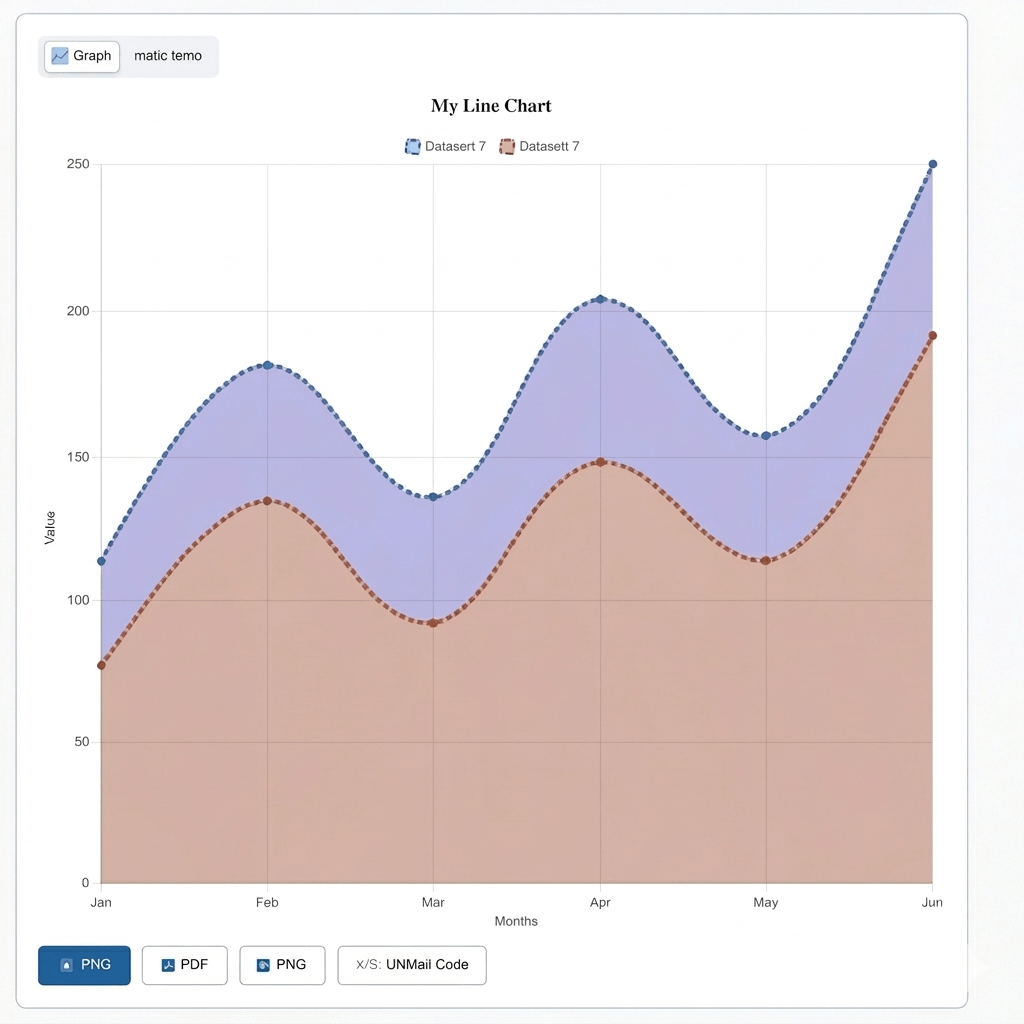
A multiple line graph is a chart with more than two or three lines on it. Each line is its own color, and all lines share the same bottom axis, usually months, dates, or categories.
Every line uses the same scale. This is what makes the chart work if each line used a different scale, comparing them would not make sense. A shared scale is what turns several lines into one real comparison, not just a group of unrelated pictures. For standard charts with one, two, or three data series, explore our Line Graph Maker to create and customize line graphs online for free.
Building a chart with several lines takes just four steps.
Step
Download your chart. Choose the file type you need see Features below for the full list.
Step
Add each data series. Give each line a name and its own set of values.
Step
Style the chart. Pick colors, choose a line style, and set where the legend sits.
Step
Adjust colors, legend position, and axis labels, then download the chart.
A fitness coach tracking three That’s it. Even a chart comparing several patient groups over 12 weeks can be built this way, with no design software needed.
Each line has its own name, colour, duplicate button, and show/hide switch. This keeps things organised as you add more lines. For charts with exactly three data series, our Triple Line Graph Maker provides a more focused way to compare trends.
The duplicate button saves time. If your lines share a similar starting point, clone one and only change the numbers that differ. You don’t need to rebuild every field from scratch.
Show/hide switches help with busy charts. Hide most lines for a moment, study just one or two closely, then bring the rest back with one click. This matters more here than on a simple two-line chart, where there’s nothing extra to hide.
This tool uses the same engine as the rest of the site, set up here with extra controls for multiple lines.
Add up to eight lines to a single graph and manage each one with simple controls. Duplicate a line, remove it, or hide it without losing your data.
Compare multiple datasets more easily with a smart legend. The tool automatically assigns different colours and lets you highlight one line while fading the others.
Import your data into a multiple line graph in just a few clicks. Enter values manually, upload a CSV or Excel file, or sync data directly from Google Sheets.
Axis and style
Customise the appearance of your graph to match your needs. Choose different line styles, adjust line width, and use a second Y-axis when comparing values with different units.
The tool automatically calculates the minimum, maximum, and average values for every line. This helps you understand your data without doing manual calculations.
Download your completed graph as PNG, JPG, SVG, or PDF. You can also create a shareable link, embed the graph on a website, and receive a helpful warning if too many lines make the chart difficult to read.
Here’s how a real comparison might look. A retailer tracking weekly sales across four store regions could plot the data like this:
Week | North | South | East | West |
|---|---|---|---|---|
1 | 4,200 | 3,800 | 4,000 | 3,600 |
2 | 4,500 | 3,900 | 4,100 | 3,700 |
3 | 4,300 | 4,200 | 4,300 | 3,900 |
4 | 4,800 | 4,400 | 4,200 | 4,100 |
5 | 5,100 | 4,600 | 4,000 | 4,300 |
With four lines on one chart, the retailer can see North pulling ahead each week, while East stays flat and West slowly closes the gap. Reading the same story from a table alone would take much longer.
You can import data into your multiple line graph in three ways:
Type them in by hand. This works well for a small comparison with just a few values per line.
Upload a file. An Excel or CSV file works too. Put your categories in the first column, and put each line’s numbers in its own column after that. Column headers become line names automatically.
Sync live from Google Sheets. This is best for reports that update often. A finance team updating a sheet each week keeps the chart current without uploading a new file every time.
The right line style depends on your data. Smooth curves suit gradual change, like slow revenue growth. Step lines suit numbers that jump at set points, like pricing tiers. Line width, usually between 2 and 4 pixels, helps a main trend line stand out from the rest.
Hovering over any point on any line shows its exact value. This works best on a screen, for a live dashboard, rather than a printed page.
A few habits keep a busy chart from turning into a mess.
Use a clear legend and distinct colors. Two shades of blue can blend together once printed.
Name each line clearly. “Series 1, 2, 3” tells a reader nothing. Real names, like “North America” or “Europe,” turn the chart into a clear story on their own.
Keep it to 3–6 lines when you can. Charts with 7 or 8 lines still work, but they take more effort to read, since every extra line adds more crossing points to follow.
Split large comparisons into two charts. Group by theme so each chart stays focused.
A fitness coach tracking three That’s it. Even a chart comparing several patient groups over 12 weeks can be built this way, with no design software needed.
When exporting a multiple line graph, each file type fits a different use. SVG stays sharp at any size, so it works well for posters or large printed reports. PNG and JPG suit slides and web pages. PDF fits formal reports and board presentations that need a print-ready file.
You can also share your chart without downloading anything. A shareable link shows the live chart to anyone who opens it. An embed code places the chart directly on a website or dashboard, and it updates automatically as your data changes.
Many people rely on this type of chart.
It’s a chart with more than two or three lines, each one a separate dataset, sharing the same bottom axis.
Up to 8 lines per chart. A warning appears past 6, since more lines can be harder to read clearly.
Yes. Upload a CSV or Excel file with categories in the first column and each dataset in its own column after that.
Yes. If you don’t choose a color, the tool picks a different one for each line automatically.
A double line graph compares exactly two things. A multi-line graph supports four or more, with extra tools to manage the added lines.
A multiple line graph maker is the right choice once your comparison grows past two or three datasets. Duplicate controls, auto colors, and show/hide switches keep several lines readable instead of tangled. Whether you’re comparing sales, test scores, or research results, this tool turns a busy spreadsheet into one clear picture no design skills needed.