
Comparing three data trends on separate charts wastes time and hides the bigger picture. A triple line graph puts three variables on one chart, so a viewer spots which one is rising, which one is falling, and where they cross, without flipping between tabs. Revenue, expenses, and profit over 12 months, for example, tell a complete story only when placed side by side on the same axis.
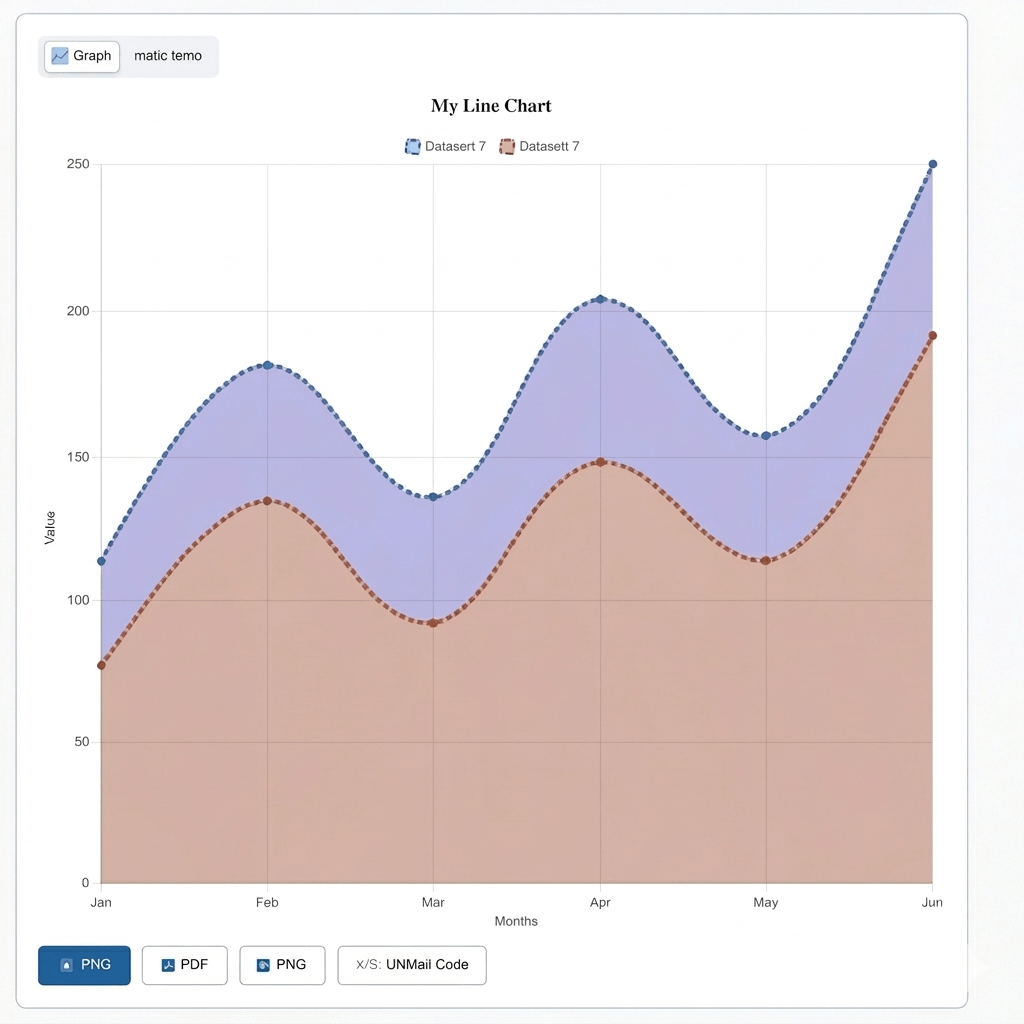
A triple line graph is a chart that plots exactly three data series on one set of axes, using three separate lines distinguished by color. A school tracking attendance across three grade levels, for instance, plots one line per grade, and a single glance shows which grade’s attendance dropped fastest during winter months.
The format differs from a standard line graph mainly in complexity. Two lines rarely overlap in confusing ways, but three lines crossing at different points need a legend, distinct colors, and enough spacing to stay readable. If you need a simpler chart with one or two data series, try our Line Graph Maker to create clear, customizable line graphs online. A triple line graph maker builds those safeguards in from the start instead of leaving a user to fix a cluttered chart after the fact.
Building a triple line graph takes four steps: add three lines, name each one, enter the values, and export the finished chart.
Step
Add three data lines using the “Add Line” button, one for each variable.
Step
Name each line clearly, for example, “Product A,” “Product B,” and “Product C.”
Step
Enter data values for each line, either by typing them in or uploading a file.
Step
Adjust colors, legend position, and axis labels, then download the chart.
A fitness coach tracking three clients’ weekly workout scores can follow these four steps and produce a comparison chart in under two minutes, without opening spreadsheet software first.
Each of the 3 lines gets its own name field, its own color, and its own show/hide toggle, so no two variables blend together on the chart.
Auto color assignment solves the most common mistake in triple line graphs: two lines rendering in shades close enough to confuse a viewer at a glance. If a user doesn’t pick colors manually, the tool assigns three visually distinct shades automatically, so a red, a blue, and a green line never turn into two reds that look nearly identical.
The show/hide toggle matters more with three lines than with two. A user comparing Line 1 and Line 2 closely can hide Line 3 temporarily, study the remaining pair, then bring the third line back without deleting any data or starting the chart over.
A clear legend and a hover-highlight effect keep three overlapping lines readable, even where all three cross near the same point.
Hovering over one legend entry bolds that line and fades the other two, so a viewer studying quarterly revenue, cost, and profit can isolate the profit line at the exact moment it crosses the revenue line, without losing track of which color belongs to which variable. Three lines rarely cause real confusion on their own; the confusion starts when colors are too close or the legend sits too far from the chart to check quickly.
Legend position matters here more than on a single-line chart. Placing the legend to the right or below the chart, rather than crowding it near the top, keeps all three names visible without covering any part of the three lines.
Data for a triple line graph can be entered manually, uploaded as a CSV (comma-separated values) or Excel file, or pasted directly from a spreadsheet.
Manual entry suits short datasets of three lines of six or seven monthly values each, for instance. Larger datasets benefit from CSV upload instead, since typing three full years of monthly data by hand invites errors. A marketing analyst comparing three ad campaigns’ click-through rates over 52 weeks can paste all three columns from Google Sheets directly into the tool, and the values populate all three lines in one action.
A table view sits behind the graph view for quick corrections. Fixing one wrong value in Line 2 doesn’t require rebuilding all three lines from scratch. If your dataset grows beyond three data series, switch to our Multiple Line Graph Maker to compare additional lines on the same chart.
Axis and Style Controls Built for 3 Lines
Both axes can be labeled, gridlines toggled independently, and the Y-axis switched between linear and logarithmic scale, depending on how far apart the 3 values run.
A “Start Y-axis from 0” toggle prevents a distorted view where small gaps between three lines look larger than they are. Line tension controls whether all three lines render as sharp angles or smooth curves, and that setting applies consistently across all three lines at once, so one line doesn’t look jagged while the other two look smooth.
Data points can be shown or hidden individually along each line. A teacher presenting three students’ test scores across five exams might keep points visible to mark each exact score, while a business report tracking daily numbers across 90 days might hide points to keep the chart clean.
Export and Share a Triple-Line Graph
A finished triple-line graph exports as PNG, JPG, SVG, or PDF and can be shared through a direct link or embedded on a website with an iframe snippet.
PDF export suits formal reports where three metrics, for example, revenue, expenses, and profit, need to appear in a printed board presentation. SVG (Scalable Vector Graphics) export suits web publishing instead, since the chart stays sharp whether viewed on a 6-inch phone screen or a 24-inch monitor.
A stats panel calculates the minimum, maximum, and average for each of the 3 lines automatically. A coach comparing three athletes’ sprint times across a season can check each athlete’s average time without running the numbers manually.
A triple-line graph fits data with exactly 3 variables, a double-line graph fits 2, and a multi-line graph fits 4 or more.
Two variables—website visits versus sign-ups, for example—read clearly on a double-line graph without needing a third color to track. Add a third variable, such as bounce rate, and a triple line graph becomes the better fit, since it’s built for exactly that count without extra warnings or crowding. Push past 3 variables, say, tracking 5 product lines at once, and a multi-line graph takes over, since it includes a “too many lines” warning that a triple-line graph doesn’t need.
Choosing the right chart type by variable count keeps a graph clean instead of forcing a fourth or fifth line onto a layout designed for three.
Students, small business owners, coaches, and analysts use a triple-line graph most often, wherever exactly three related trends need direct comparison.
A student comparing rainfall across three cities for a geography project needs three clean lines on one chart, not three separate graphs to flip between. A small business owner tracking revenue, expenses, and profit needs all three on the same timeline to see the real margin trend, not just two out of three. A coach comparing three athletes’ race times, or an analyst comparing three regions’ quarterly sales, both need the same structure: three variables, one chart, and one clear comparison.
Mobile access matters across every one of these cases. A coach checking three athletes’ progress on a phone between practice sessions needs the chart to render correctly on a small screen, with the legend still readable at that size.
A triple line graph is a chart with exactly three data series plotted on one set of axes, each shown as a separate colored line for direct comparison.
A double line graph compares 2 variables, while a triple line graph adds a third line, fitting data with exactly 3 related trends to track.
Yes. CSV and Excel files upload directly, and the tool populates all three lines automatically without manual retyping.
Yes. If colors aren’t chosen manually, the tool assigns three distinct shades automatically, keeping all three lines visually separate.
PNG, JPG, SVG, and PDF cover image, web, and print needs, with PDF suited to formal reports and board presentations.
A triple line graph works best when exactly three related variables need one chart instead of three. Auto color assignment, a hover-highlight legend, and per-line show/hide toggles keep three overlapping trends readable instead of tangled, while CSV upload and PDF export cover both quick classroom projects and formal business reports. Whether the three lines track three product revenues, three athletes’ times, or three cities’ rainfall, the same four-step process applies: add three lines, name them, enter the data, and export.