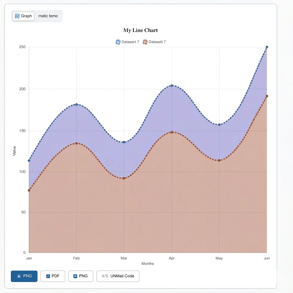
If you want to show how something changes with time, you can use a line graph. It’s like connecting dots together. You can think of each dot as a number, and when you connect them with a line, it will help you see if things go up, go down, or stay the same.
You see line graphs everywhere. In school, on the news, and even on your phone when you check the weather. But not all line graphs look the same. There are different types of line graphs, and each one is used for a different reason.
With the help of this guide, you can learn about all the different types of line graphs, what each one looks like, and when to use them. You can also learn what the different parts of a line graph are, the types of lines you can see, and some real-life examples so you can understand everything easily. If you want to make a line graph, use our line graph maker tool free of cost.
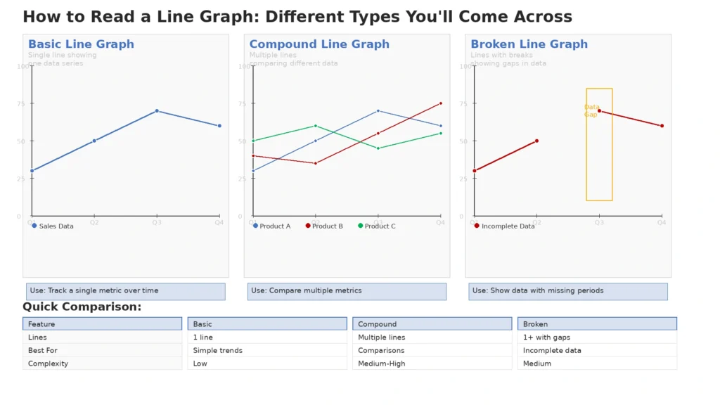
A simple line graph is the easiest type of a graph. It has only one line on the chart, so it is very easy for you to understand it.
You use it when you want to show one thing over time. For example, you can use it to show how the temperature changes every day for a week, or how much money a small shop makes each month.
As there is only one line, it is very easy for you to see the changes. You can easily tell if things went up, down, or stayed the same.
This line graph is similar to a simple line graph, but it has two or more lines on the chart instead of just one. Each line shows a different thing, and they all share the same chart.
You can use it when you want to compare two or more things at the same time. For example, you can use it to show the changes in sales of two different products over a year, or if you want to compare the temperature of two different cities during a week.
Since all the lines are on the same chart, you can easily see how they relate. You can easily see which one is higher, which one is lower, and where they meet.
The compound line graph is a little different from the other two. In a compound line graph, the lines are placed on top of each other instead of being shown separately. Each layer is placed on top of the one below it, so the chart shows the total and each part.
You can use it to show how different parts build a whole over time. For example, you can use it to show how your total monthly budget goes to food, rent, and transport each month.
The bottom layer shows the first value, the next layer adds the second value on top, and it continues like this. This can help you see each part and the overall total at the same time.
Personalize the chart
Create a professional line graph in seconds. No signup, no credit card.
A step line graph is a little different from a regular line graph. Instead of a straight or smooth line, it goes up and down like stairs. The line is flat, then goes up or down, then flat again.
You can use it when your data changes suddenly and then stays the same until it changes again. To give an example, if a shop changes its prices a few times a year, a step line graph is a good way to show it. The price stays the same for some time, then goes up or down, and stays there again.
It is a great way if you have data that changes quickly instead of changing slowly with time.
Curved or smoothed line graphs are just like the simple line graph, but instead of straight lines between the dots, the line is smooth and curved. It makes the chart look softer and more natural.
If your data changes slowly, you can use it to show a smooth line. Take this as an example, you can use it to show how the population of a city increased slowly over many years.
Keep in mind that the curve does not add new data. It only makes the line smoother so you can see the overall changes more easily. Sometimes it can make small changes look bigger or smaller than they really are, so you should always check the actual data too.
An area line graph looks a lot like a simple line graph, but the space under the line is filled with color, and that is what makes it an area line graph.
If you want to show the growth of something with time, you can use it. As an example, you can use it to show monthly visitors of a website during a year. The shaded area makes it easier to see the total.
The color also makes the chart easier to see and more clear, it is really helpful especially when you want to show a big change or slow growth over time.
A sparkline is a very small and simple line graph. It is a small line with no labels, axis, or title.
It can be placed in a table, sentence, or data screen without taking up much space.
If you just want to give a quick idea about the changes without going in much detail, you should use this. Take this example, a business might show a small sparkline next to a sales number to show sales changes in the past few months.
You can think of it as a smaller version of a line graph. It does not give exact numbers, but it makes it easy to see if things are rising or falling.
A band or range line graph uses two lines and fills the space between them with color. The top line shows the highest value and the bottom line shows the lowest value. The filled in space between them is called the band.
You use it when you want to show how much values change over time. Think of this as an example: You could use it to show the highest and lowest temperatures each day for a month.The band shows how far apart the highest and lowest values were on each day.
It is an easy way to show high and low values, so you can see the data more clearly.
When the increasing line goes up from left to right, this means the value is going up over time. For example, if a shop is making more money each month, the line on the group will keep going up. A sharper line means faster growth
A decreasing line goes down from left to right, when this happens it means the value going down over time. Take this example, if the number of visitors at a store keeps going down, the line goes down. If the line drops more sharply, the decline is faster.
A flat line remains at the same level from left to right. This means there is no change in the value. Such as, if the sale of a product has the same sales every month for a year, the line will be flat. This shows things are staying the same and stable.
Slope tells you how fast something is going up or down. A very sharp line means the value is changing very quickly, going up or down fast, and a gentle slope means the value is changing slowly. Think of it this way: a sharp upward line on a sales chart means sales went up quickly in a short time, while a slow rise means sales grew slowly over a long time.
Title
The title of a graph tells you what it is about. It is shown at the top of the chart and quickly tells you what the data is about. Your title should be short and clear, so people know exactly what they’re looking at.
X-axis and Y-axis
The x-axis is the bottom line of the graph. It usually shows time, like days, months, or years. The y-axis is the line that goes up the side of the graph, and it shows the numbers you are tracking. Both lines together create a chart for the data.
Labels
Labels tell you what each axis is about. If there is no label, you would not know what the numbers on the graph mean. Such as, the x-axis can be Months and the y-axis can be Sales in Dollars. Labels help you understand the graph quickly.
Scale
The scale is the numbers on the y-axis. It shows the value of each step on the axis. Think of a scale going from 0 to 100, with steps of 10. Choosing the right scale is important because it can change how the data looks.
Points
Points are the dots on the graph that show the values in the data. Each point is where the time and value meet on the graph. All the points connect to make a line.
Line and Legend
The line connects all the points and shows how things changed. In a multiple line graph, there is more than one line, and each line has a different color. The legend shows what each color means, so you know which line belongs to which category.
If you want to show changes over time, a line graph is a good choice. Whether you are looking at days, months, or years, the line helps you spot changes easily.
If you want to compare changes of different things at the same time, a multiple line graph is ideal. The chart shows both trends together, so differences are easy to notice.
A line graph is best for continuous data that flows without breaks. For instance, things like temperature, speed, and population are continuous. The line connects the points smoothly because the data between them also makes sense.
If the data doesn’t connect smoothly from one point to another, a line graph is not suitable. Joining unrelated points with a line can confuse people and show the wrong meaning.
If you want to compare separate categories, like the sales of five different products, a bar graph is a better choice. A line graph is used for data that changes over time, not for comparing different categories.
If you have too many lines on one chart, it can become difficult to read and understand. In that case, it’s better to show the data in different charts
A line graph shows how something changes over time using a connected line. A bar graph uses different bars to show and compare category values. If you want to show a change over time, use a line graph. And If you want to compare amounts side by side, use a bar graph.
In a line graph data points are connected with a line to show a change. Whereas, a scatter plot shows data points without joining them, so you can see relationships between two things. If your data has a clear time based change, a line graph works better. But if you want to see how two things are related, you should choose a scatter plot.
A line graph displays real data from different times. A quadratic or cubic graph shows a math equation and makes a curve line from it. We use line graphs for daily data, but quadratic and cubic graphs are mostly used in math and science for equations.
Businesses use line graphs to check how their sales go up or down over time. Just by looking at the graph, you can tell if sales are rising, slowing, or staying the same.It helps business owners make fast decisions from real data.
Weather forecasters use line graphs to show how weather conditions like temperature and rainfall change over time. It’s a simple way to see patterns in weather data.
Stock market data is usually shown using line graphs. Investors use these graphs to see changes and decide when to buy or sell.
Governments and researchers use line graphs to see how the population of a city or country has gone up or down over many years. It helps them decide where to build schools, hospitals, and housing.
One of the biggest mistakes is not checking the scale on the y-axis. If the scale doesn’t start at zero, small changes can look bigger than they are. So you should always check the scale before you decide.
When a graph has several lines, you might mix them up easily. So you should always check the legend before reading the data so you know which line belongs to which category.
Just because a line has been rising doesn’t mean it will always rise. Don’t think the pattern will stay the same, especially when the data goes up and down.
In math, there are three main types of line graphs: simple, multiple, and compound line graphs. There are also different types like step, curved, area, sparkline, and band or range graphs. Each one is used based on the data you have.
The 3 main types of line graphs are the simple line graph, the multiple line graph, and the compound line graph. A simple line graph shows one change, a multiple line graph compares changes, and a compound line graph shows how a whole is split into parts.
The main types of line graphs are simple line graphs, multiple line graphs, and compound line graphs. Other variations include step line graphs, curved line graphs, area line graphs, sparklines, and band or range line graphs.
A non-linear line graph is one where the line is not straight. Instead, it is curved or bent. This happens when the data doesn’t go up or down in a regular way. A curved line graph is a common example of a non-linear graph.
A simple line graph has one line showing data over time. Whereas, a multiple line graph uses several lines on one chart to compare different sets of data at the same time. The difference is the number of things you measure.