
How to Create a Line Graph with X and Y Axes (Step-by-Step Guide)
To create a line graph, put your categories – dates, months, or test names – on the X-axis. Put your numeric values like marks or scores on the Y-axis, then connect the points with a line. This simple structure turns raw numbers into a visual story anyone can read at a glance.
But most students freeze the moment they sit down to actually make one. Say you scored 65% in your first test, 72% in your second, and 80% in your third. You know you’re improving. The numbers prove it. But turning those three scores into a clean, connected graph? That’s where things get confusing. Which axis gets the test number? Where do the percentages go? One misplaced point, and the whole graph looks wrong.
You can draw this by hand or use Excel, Google Sheets, or a free online line graph maker. Each one works differently, and a single mistake can throw off your entire chart.
Let me know if the transition from paragraph one to two feels smooth enough now, or if you’d like me to adjust it.
What Is a Line Graph with X and Y Axes?
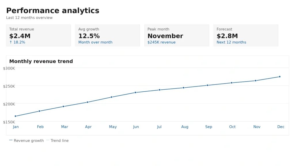
A line graph is a chart that connects data points with straight lines to show how one value changes as another value changes. It sits on a grid formed by two axes that cross at a single point.
- X axis (horizontal): The independent variable — the value you already know, like a date or category. It doesn't depend on anything else in the chart.
- Y axis (vertical): The dependent variable — the number that changes, like revenue, temperature, or page views.
- Origin: The point where the two axes meet, always (0, 0).
A rising line means growth. A falling line means decline. A flat line means no change.
When Should You Use a Line Graph?
Use a line graph when your data has a clear order, and you want to show change across that order, for example:
- Tracking daily, weekly, or yearly trends
- Highlighting small changes by adjusting the Y-axis scale
- Comparing two or more groups on one chart
- Plotting continuous data, like time, temperature, or price
- Showing how one variable moves in relation to another
Avoid a line graph when:
- You're comparing unordered categories, like sales across different stores; use a bar chart instead
- You have so many data points the line turns cluttered — split into smaller charts
- You're showing how parts make up a whole, like market share — use a pie or stacked bar chart
Types of Line Graphs
Five popular line graph styles and the example each suits best.
Type | Description | Best For |
|---|---|---|
Simple Line Graph | One line, one variable | A single trend over time |
Multiple Line Graph | Two or more colored lines on the same axes | Comparing groups side by side |
Compound Line Graph | Stacked lines showing running totals | Showing cumulative data |
Double Line Graph | Two lines on one chart | Comparing two subjects over time |
Step Line Graph | Lines move in steps instead of diagonals | Data that changes at fixed intervals, like interest rates |
Parts of a Line Graph
Every line graph is built from the same core parts, and knowing what each one does helps you build a chart that reads clearly.
- Title : Tells readers what the graph is about, so they can understand the data at a glance.
- X axis : Displays the independent variable, such as time or categories, and provides the order for your data.
- Y axis : Shows the values being measured, making it easy to compare increases, decreases, and overall trends.
- Data points : Represent the individual values on the graph. Each point marks where an X value and a Y value meet.
- Line : Connects the data points to show how values change over time or across categories.
- Legend : Identifies each line by name or colour, making it easier to compare multiple datasets.
- Scale : Determines the spacing between values on each axis. A consistent scale ensures the graph represents the data accurately.
- Labels : Explain what each axis measures and include the unit, such as Time (Months) or Sales (USD), so readers can interpret the graph correctly.
How to Make a Line Graph with X and Y Axis (Step By Step)
Creating a line graph with X and Y axes is simple once your data is organised. Follow these steps to create a clear and accurate line graph:
Organize Your Axes
- Identify your independent variable (what you already know, like a date).
- Identify your dependent variable (what changes, like sales).
- Sort your data into two columns: X values and Y values.
- Sort rows by X value, smallest to largest — unsorted rows make the line zigzag and misrepresent the trend.
- Remove blank cells, duplicates, or inconsistent formatting.
- Store X values as real numbers or dates, not text — text values get spaced evenly by most tools even when the real values aren't, which distorts the line's shape.
Choose the Right Scale for Each Axis
- X-axis scale: Covers the full range of your data with equal spacing between increments.
- Y-axis scale: Usually starts at zero. If your data range is small and zero flattens the trend too much, start higher and mark the break with a break symbol (⌇).
Each axis is scaled to fit its own data – the X and Y axes don't need to match each other. Label each axis with its data type and unit, such as "Time (weeks)" or "Revenue (USD)".
Open Your Line Graph Maker
- Open a free online line graph maker, or use Excel or Google Sheets.
- Select "Line Graph" or "Line Chart" as the chart type.
- Find the X-axis and Y-axis data entry fields.
Enter Your X-Axis and Y-Axis Data
- Enter your X-axis values.
- Enter the Y values that correspond to each X point.
- Add each additional data series separately if you're plotting multiple lines.
- Label each axis in the tool's settings.
Customize the Graph
- Add a descriptive title that states what the graph shows.
- Use a distinct colour for each line if you have more than one.
- Add a legend for multiple data series.
- Adjust gridlines, marker size, and line thickness for readability.
Review and Download
- Confirm every data point is plotted where you expect.
- Check that axis labels, units, and scales match your data.
- Export as PNG, SVG, PDF, or embed code.
Best Free Online Tools for an X and Y Axis Graph Maker
Comparison of popular tools, their free plans, and export options.
Compare different line graph tools and their features to find the best one for your needs.
| Tool | Free Plan | Two Y-axis supports | Export Formats |
|---|---|---|---|
| Free Line Graph Maker | Yes | Yes | PNG, SVG, PDF |
| Google Sheets | Yes | Yes | PNG, PDF |
| Microsoft Excel | Limited (free web version) | Yes | PNG, PDF |
| Datawrapper | Yes | Yes | Embed, PNG |
| Canva | Limited | No | PNG, PDF |
| Chart.js (for developers) | Yes | Yes | SVG, PNG |
How to Make a Line Graph with Two Y Axes
A dual Y-axis graph compares two metrics with different units or scales on one chart, without one line flattening the other. Use it when you:
- Compare revenue against a conversion rate shown as a percentage
- Plot temperature and precipitation on the same monthly chart
- Track website sessions alongside ad spend in a marketing dashboard
Setup:
- Left Y-axis: Your primary metric, like total sales in USD.
- Right Y-axis: Your secondary metric, like a customer satisfaction score out of 10.
- Both Y-axes share the same X-axis, usually time.
- Use a different color per line and label both Y-axes with their units.
- Add a legend showing which axis each line belongs to.
Two Y-Axes in Google Sheets
- Select your full data range, including both data series and the X-axis labels.
- Go to Insert → Chart → Line chart.
- Open Chart Editor → Customise → Series.
- Select the second data series and check “Use right axis”.
- Label both Y-axes under Vertical axis settings.
Two Y-Axes Using an Online Line Graph Maker
- Open a dual-axis line graph maker.
- Enter your X-axis data (time or category labels).
- Assign your first data series to the left Y-axis.
- Assign your second data series to the right Y-axis.
- Label each axis with its metric and unit.
- Download or share the finished graph.
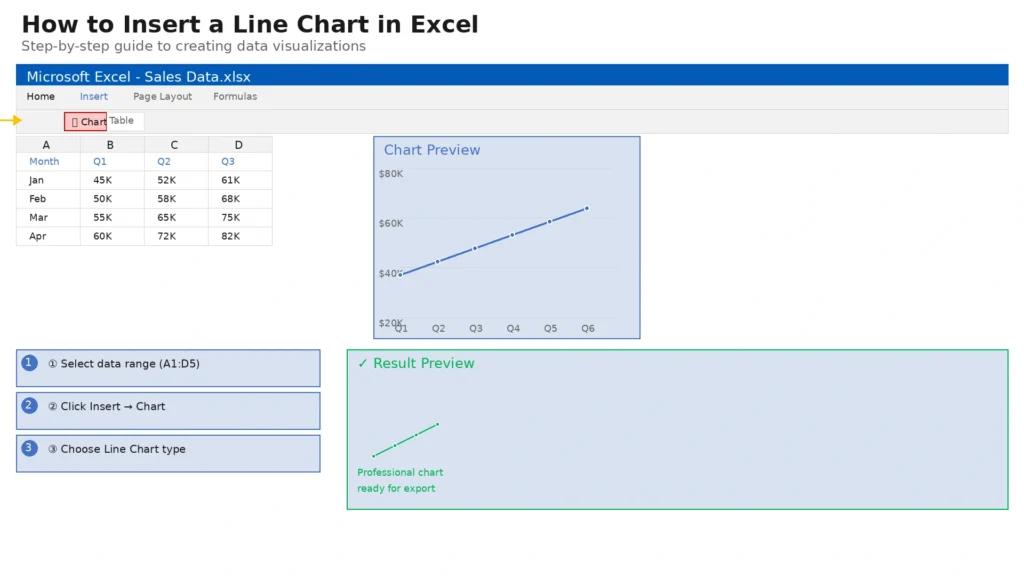
How to Make a Line Graph with X and Y Axis in Excel
- In Row 1, add column headers for each data series — e.g., “Year,” “Product A Sales”, and “Product B Sales”.
- In Column A, enter your X-axis values, such as 2019, 2020, and 2021.
- Enter the matching data values in the columns beside them.
- Select the entire data range, including headers.
- Go to Insert → Charts and pick the chart type that matches your X values:
- Real numbers (measured distances, lab readings) → Scatter with straight lines, which keeps spacing proportional to the actual values.
- Dates or a short list of categories (years, quarters) → Line with Markers, which spaces points evenly by design.
- Excel builds the chart and fills in both axes automatically.
- Right-click either axis to adjust its scale, number format, or labels.
- To add a second Y-axis, right-click a data series, choose Format Data Series, then check Secondary Axis.
Create Line Graphs on Mobile Devices
You can build a line graph on a phone or tablet without a desktop computer. Most modern graph makers run smoothly in mobile browsers.
The Google Sheets mobile app lets you enter data and create basic line graphs on the go. For more customization, many online graph makers accept CSV or Excel uploads and let you edit and download the chart directly from your mobile device.
Real-World Uses of a Line Graph
Line graphs help you track changes, compare data, and identify trends over time. They are widely used in business, education, research, and everyday life.
Use Case | How a Line Graph Helps |
Stock Prices | Track price changes over days, weeks, or months to identify market trends. |
Website Traffic | Compare daily or monthly visitors and measure the impact of marketing campaigns. |
Student Grades | Monitor improvements in test scores throughout a semester or school year. |
Fitness Progress | Visualize changes in weight, running distance, workout performance, or calories burnt. |
Weather Data | Compare daily temperatures, rainfall, humidity, or wind speed over time. |
Sales Reports | Track sales, revenue, and profit to measure business performance. |
Scientific Experiments | Display changes in measurements collected during research and laboratory testing. |
Common Mistakes That Make a Line Graph Misleading
- Uneven tick spacing: Every gridline should represent the same increment.
- Missing axis labels or units: “Revenue” isn’t enough write “Revenue (USD)”.
- Swapped axes: Time almost always belongs on the X-axis; reversing it reverses the story.
- A scale that cuts off data: If your max value is 95 but the Y-axis stops at 80, part of your data disappears.
- Too many lines on one chart: More than five or six lines create visual noise split into separate charts.
- Unsorted X values: Unsorted rows make the line zigzag and misrepresent the trend.
- Connecting points that shouldn’t be connected: A line implies continuity. If your points are independent observations, use markers without a connecting line, or switch to a bar chart.
Practical Tips for Better Line Graphs
- Start the Y-axis at zero whenever possible starting higher can make small changes look larger than they are.
- Add markers to each data point so readers can see exact values.
- Use two or three contrasting colors and avoid red-green combinations, which are hard for color-blind readers to distinguish.
- Label lines directly instead of relying only on a legend.
- Use light gridlines enough to help readers estimate values, not so many the chart looks cluttered.
FAQs:
What is the difference between an X-axis and a Y-axis?
The X-axis runs horizontally and shows the independent variable, such as time or category. The Y-axis runs vertically and shows the values that change based on the X-axis.
Can I make a line graph without Excel?
Yes. Free online graph makers let you build a line graph directly in your browser enter your data, customise the chart, and download it without installing software.
What file formats can I download a line graph in?
Most online line graph makers export as PNG, SVG, PDF, or JPG, and many also provide an embed code for websites or presentations.
How many data points should a line graph have?
There’s no fixed limit. A line graph works best with enough points to show a meaningful trend without becoming hard to read; split very large datasets into multiple graphs.
Can I edit my line graph after creating it?
Yes. Most graph makers let you reopen your project and update the data, colors, labels, title, or axis settings before downloading the final version.
What should go on the X-axis of a line graph?
The X-axis usually carries the independent variable time, dates, months, years, or categories and sets the order your data follows from left to right.
Can a line graph have multiple lines?
Yes. A line graph can show two or more lines to compare datasets on one chart, each with a unique color and label.
Conclusion
A line graph with X and Y axes shows how data changes over time or how two values relate to each other. Start with organised data, choose a scale that matches your values, and label both axes clearly. A free online line graph maker makes it easy to produce a clean, accurate graph.